KDE 4 is coming. It’s starting to look and behave mature enough to use it on a normal desktop. This article is a little introduction to what you might be expecting from the brand new KDE due later this year.
It’s been a whole month when I’ve investigated the new environment called KDE 4. Honestly I wanted to wait till “Beta 3″, which should have appeared on 5th October. But as you all can see it has never happened. On the IRC channel #kde4-devel I was informed that the “Beta 3″ should have been tagged yesterday but unfortunately it didn’t turn out to be true. Not waiting any longer I made my mind and I have updated the SVN and have run the cmake.
First glance
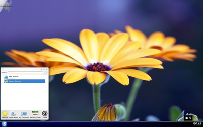
Right after running the KDE you can tell at once that new wallpaper is far more beautiful than the grey old one and the marvelous contrasting flower is well matched to the bottom bar. Unluckily it does nothing more than displaying the clock. The taskbar despite the fact it was on the bar didn’t display processes and all the effort I made to add there any applet or the Pager was in vain, and ended with a complete crash of the bar. The only thing I succeeded in was to put there the Kickoff menubar.
Kickoff – the new KDE menu
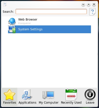
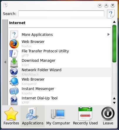
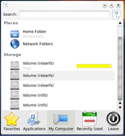
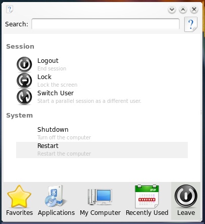
The first appearance of Kickoff was in SUSE Linux 10.2 as a new menu for KDE. The icons were arranged in five categories: Favorite, Applications, My Computer, Recently used, Leave. There is nothing more than the search box that helps you finding applications and documents. It’s too early to discuss about the new KDE menu even talking about its appearance. IMHO I wish that the searching engine wouldn’t be based on Nepomuk or Strigi. I’d like to mention that it is only the initial version of this menu in KDE.
Kget – is still surprising
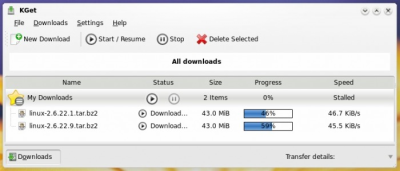
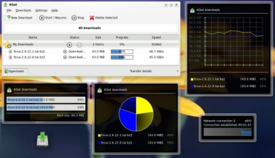
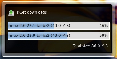
I’ve talked about this program a lot so far. Even now there has changed a lot of stuff, not only the appearance but the functionality. I’ll shortly remind that Kget is the download accelerator that provides you quequing, placing files in a specific directory chosen by some criteria. This version is enriched with the Transfer Graph applet, which shows you the graph of the download speed of current file. It’s the third applet like this. The first two are: Pie Graph and Bar Chart.

Plasma – new applets
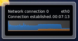
I’m used to some sort of nice rule. All the time I check the state of KDE 4 I meet new Plasmoids – so is now. The first one is the old well-known Network Monitor which transformed from two flushing monitors to the graph that shows the traffic flow.
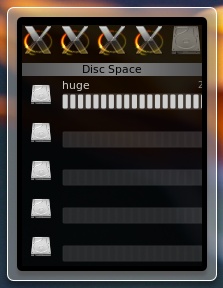
The next two applets are quite new. The first one is the System Monitor. This applet in the intention of the creators will inform you about the state of the main parts of your PC. In the future you can expect for reading ACPI information such as temperature or fan speed. Unfortunately at the moment the applet tries to perform only the usage of the disc space.
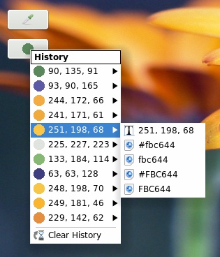
Today the best applet I’ve tried was the Color Picker. It helps you to “pick†the color of any pixel on the screen. Using the standard tool, the “pipetteâ€, you are provided with the color in a few color formats. Very interesting feature it seems to be the probe history that shows a few earlier tries.
KWin Composite – defaultly enabled
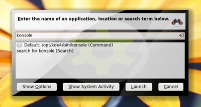
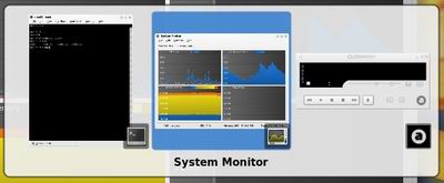
It seems that KWin Composite effects are defaultly enabled. You can notice shadows under windows and the animated windows’ minimization. There are also available features from Compiz Fusion that pointing at the left top corner of the screen you are starting something similar to Scale plugin. Switching between windows using Alt+Tab displays thumbs of the windows. Quite interesting is the fact that KRunner looks different from when the Composite effects are disabled.
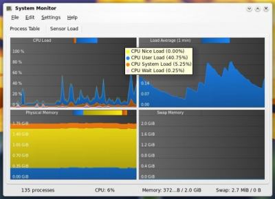
KSysGuard – the system guard
The System Guard has also changed its appearance by the new background under the graphs.
KStyle / KWin – styles and decorations
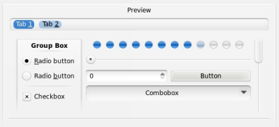
It is a rule that I always look very carefully at the appearance comparing Oxygen with Bespin (the unoffical style). IMHO Oxygen still seems too less contrast. I think authors are deserving of credit for continuous improvement. From the last version they improved the appearance of tabs and the highlightment of elements and buttons. The scrollbar turns to green under the mouse point. But still it is far away from mockups in the Internet.
At last the buttons have tooltips. Now you don’t have to think which button closes the window ![]()
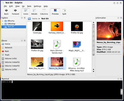
Dolphin and Kate – the new appearance
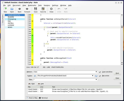
It is the high time to see how some applications look like in Oxygen. I’ve tried the file manager Dolphin and the text editor Kate.
Amarok – at least there is some noise!
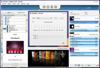
At the end I’ve checked my favourite audio player. The best way to describe it is to say “sometimes better. sometimes worseâ€. This time I couldn’t manage to make a collection, not even play one mp3 :/ But instead I could connect to Jamendo and listen to their songs. Thanks to that you can see how the Amarok looks like.
This article is a direct translation of text published on author’s blog: KDE 4 rev 723381
